Guest Post by Marc Sampogna, Founder, Canopy
Rebranding can be tricky. It takes guts, smarts, and vision. Especially when that rebranding involves a logo and name change.
I’ve been a branding expert for about 20 years, and have known Dean Stallone, the founder of WNDW for almost 15, so when he asked me to provide my perspective on his company’s rebranding it was an easy decision.
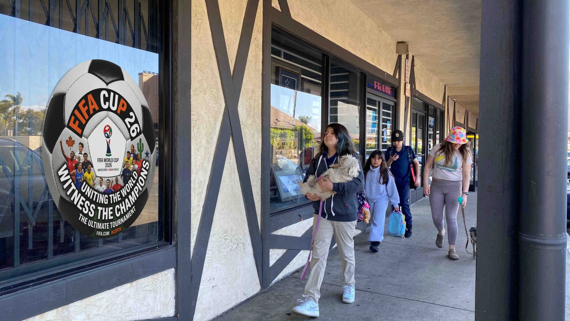
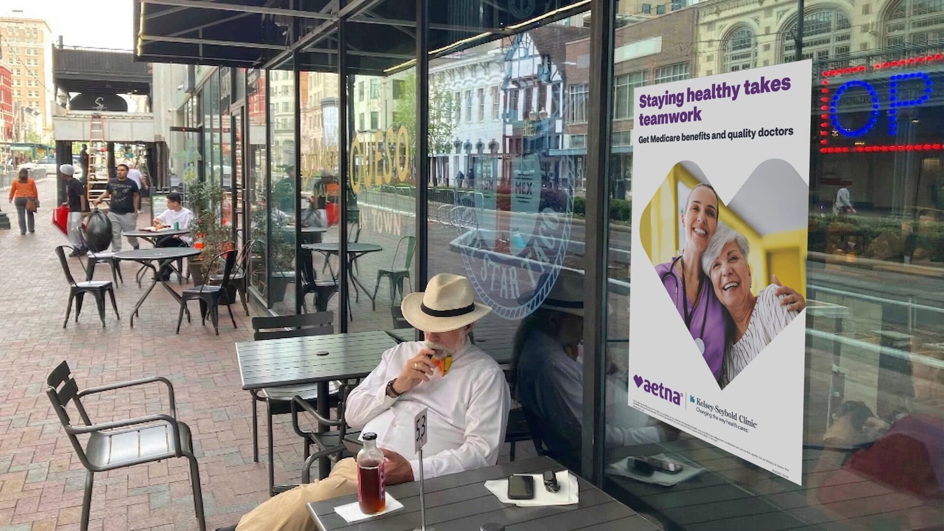
As long as I’ve known Dean, I’ve been pushing him to create some type of a shift in branding for his company that truly conveys the what and why of the business. And with WNDW, maybe that was a simple thing like having the letters stand for something related to media/advertising placements in independent storefronts, or something even bigger. But this wasn’t just a name change, Dean and his team are beginning to expand their services by turning their static storefront billboards into digital products using LCD screens – so this rebranding comes at an opportune time.
I mentioned how rebranding needs to start from a place that’s tied not just to what you do, but why you do it and the people that make it happen. And with PMD Media, in my opinion, it’s always been about finding and delivering the best exposure for your product or service, which their people really do. Their ability to get your ad seen, in a street-level storefront window, all ties to the idea of visibility. So when Dean shared his intent to change the company name to WNDW, I felt it was a natural evolution of the business, and it made sense.
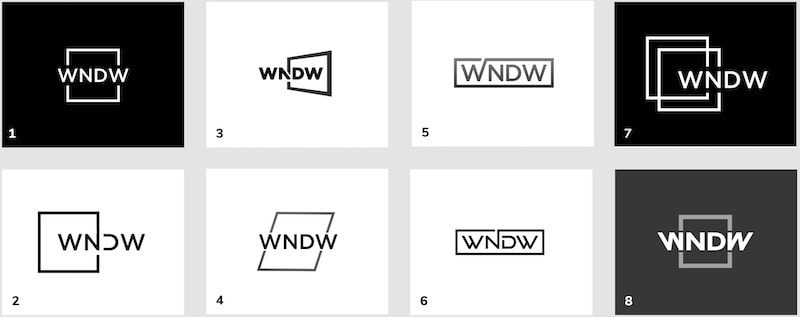
“We See Through Windows”
But with a name change also comes a logo change. And what Dean and his team landed on for WNDW really hits the mark. We see through windows, light shines through windows – windows provide a micro-break for our minds. (Man, that’s a lot of fluff!) But in all honesty, the design is simple, direct, and most importantly in my mind, inviting. All the things I’ve been wishing for the last 15 years have become a reality!
So now we have a new name and logo, what’s next? Educating the market on it. Oh, where do we begin on how to do this? I’ve been involved with major brand redesigns over the years, and have seen them introduced in a way that was embraced by their audience, as well as rejected. It’s a sensitive exercise, so if you’re going all in, you’ve got to be strategic about it and not just rip the bandaid off.
How have some other brands done this? Let’s take a quick look, starting with Dunkin’, formerly known as ‘Dunkin’ Donuts’ – now that’s an easy one. They dropped the signature item from their name, moving away from being “just a pastry shop”, and more about fueling America, hence, ‘America Runs on Dunkin’’. Simple enough.
How about Meta, formerly known as Facebook? Now this one’s a bit trickier. A complete name change, a new logo, and a huge mountain to climb by focusing more on becoming a metaverse company rather than a social technology company. They’ve certainly pumped a lot of money into introducing the new brand, but the jury is still out on this one. Let’s talk in another year or so.
Again, rebranding is a very tricky and sensitive exercise. But I believe Dean and his team have taken the proper steps to ensure that this transition from PMD Media to WNDW is embraced and not rejected. What do you think? I’m super excited to see how it takes shape.
Get in touch with Marc Sampogna & Canopy